Integration analysis of multi-sample single cell RNA-seq experiment
Yunshun Chen
Walter and Eliza Hall Institute of Medical Research, 1G Royal Parade, Parkville, VIC 3052, Melbourne, Australiayuchen@wehi.edu.au
Aug 21, 2021
Source:vignettes/SingleCellWorkshop.Rmd
SingleCellWorkshop.RmdIntroduction
Single-cell RNA sequencing (scRNA-seq) has become a widely used technique that allows researchers to profile the gene expression and study molecular biology at the cellular level. It provides biological resolution that cannot be achieved with conventional bulk RNA-seq experiments on cell populations.
Here, we provide a detailed workflow for analyzing the 10X single cell RNA-seq data from a single cell RNA expression atlas of human breast tissue (Pal et al. 2021). This cell atlas explores the cellular heterogeneity of human mammary gland across different states including normal, pre-neoplastic and cancerous states.
We will be using part of this cell atlas data to demonstrate how to perform a standard analysis for examining one single cell sample, an integration analysis for exploring the cellular heterogeneity across multiple samples, and how to perform differential expression analysis using pseudo-bulk approach. Most of the analysis will be performed using the Seurat package (Satija et al. 2015).
Preliminary
Pre-processing the raw data
The raw 10X data come in BCL format. They need to be pre-processed by software tools such as cellranger.
We use cellranger to convert BCL files into the FASTQ files, then align the reads to the human genome, and finally quantify the UMI counts for each gene in each cell. The entire analysis in this workflow is conducted within the R environment using the outputs from cellranger. We do not cover the details of running cellranger as they are beyond the scope of this workflow. The information of how to run cellranger is available at here.
Downloading the read counts
In this workshop, we will be using four samples from this published study (Pal et al. 2021). These four samples correspond to four individual patients with the following Ids: N1469, N0280, N0230 and N0123. The accession numbers of the four samples are GSM4909258, GSM4909255, GSM4909264 and GSM4909267, respectively.
We first create a Data folder under the current working directory. Then we make four subfolders with the patient Ids as the folder names under the Data folder.
Samples <- c("N1469", "N0280", "N0230", "N0123")
for(i in 1:length(Samples)){
    out_dir  <- file.path("Data", Samples[i])
    if (!dir.exists(out_dir)) dir.create(out_dir, recursive = TRUE)
}
The cellranger output of each sample consists of three data files: a count matrix in mtx.gz format, barcode information in tsv.gz format, and feature information in tsv.gz. We download the three data files from GEO for each of the four samples and store them in each of the subfolders accordingly.
GSM <- "https://ftp.ncbi.nlm.nih.gov/geo/samples/GSM4909nnn/"
url.matrix <- paste0(GSM,
    c("GSM4909258/suppl/GSM4909258_N-NF-Epi-matrix.mtx.gz",
      "GSM4909255/suppl/GSM4909255_N-N280-Epi-matrix.mtx.gz",
      "GSM4909264/suppl/GSM4909264_N-N1B-Epi-matrix.mtx.gz",
      "GSM4909267/suppl/GSM4909267_N-MH0023-Epi-matrix.mtx.gz"))
url.barcodes <- gsub("matrix.mtx", "barcodes.tsv", url.matrix)
url.features <- "https://ftp.ncbi.nlm.nih.gov/geo/series/GSE161nnn/GSE161529/suppl/GSE161529_features.tsv.gz"
for(i in 1:length(Samples)){
    utils::download.file(url.matrix[i], destfile=paste0("Data/", Samples[i], "/matrix.mtx.gz"), mode="wb")
    utils::download.file(url.barcodes[i], destfile=paste0("Data/", Samples[i], "/barcodes.tsv.gz"), mode="wb")
    utils::download.file(url.features, destfile=paste0("Data/", Samples[i], "/features.tsv.gz"), mode="wb")
}
Standard analysis
Read in the data
We load the Seurt package and read in the 10X data for Patient N1469. The object N1469.data is a sparse matrix containing the raw count data of Patient N1469. Rows are features (genes) and columns are cells. By default, the column names of the data are the cell barcodes. To distinguish cells from different patients in the integration analysis later on, the patient Id is added as a prefix to the column names.
library(Seurat)
N1469.data <- Read10X(data.dir = "Data/N1469")
colnames(N1469.data) <- paste("N1469", colnames(N1469.data), sep="_")
We then create a Seurat object N1469. Genes expressed in less than 3 cells are removed. Cells with at least 200 detected genes are kept in the analysis.
N1469 <- CreateSeuratObject(counts=N1469.data, project="N1469", min.cells=3, min.features=200)Quality control
Quality control is essential for scRNA-seq analysis. Cells of low quality and genes of low expression shall be removed prior to the analysis.
Two common measures of cell quality are the library size and the number of expressed genes in each cell. The number of unique genes and total molecules (library size) are automatically calculated during CreateSeuratObject(). Another measure to look at is the proportion of reads from mitochondrial genes in each cell. Cells with higher mitochondrial content are more prone to die, and hence should also be from the analysis (Ilicic et al. 2016). Here, we calculate the percentages of reads from mitochondrial genes and store them in the metadata of the Seurat object. We use the set of all genes starting with MT- as a set of mitochondrial genes.
N1469[["percent.mt"]] <- PercentageFeatureSet(N1469, pattern = "^MT-")The QC metrics of a Seurat object can be viewed as follows.
head(N1469@meta.data)## orig.ident nCount_RNA nFeature_RNA percent.mt
## N1469_AAACATACGGAGCA-1 N1469 7459 1870 2.65
## N1469_AAACATTGCCTCAC-1 N1469 5457 1393 1.89
## N1469_AAACATTGGTAGGG-1 N1469 7547 1964 2.09
## N1469_AAACCGTGCAGTTG-1 N1469 765 328 38.17
## N1469_AAACCGTGCATGAC-1 N1469 3908 1294 5.12
## N1469_AAACGCACTCAGGT-1 N1469 7218 2102 2.13Scatter plots can be produced for visualizing some of the QC metrics.
plot1 <- FeatureScatter(N1469, feature1 = "nCount_RNA", feature2 = "percent.mt", plot.cor=FALSE)
plot2 <- FeatureScatter(N1469, feature1 = "nCount_RNA", feature2 = "nFeature_RNA", plot.cor=FALSE)
plot1 + plot2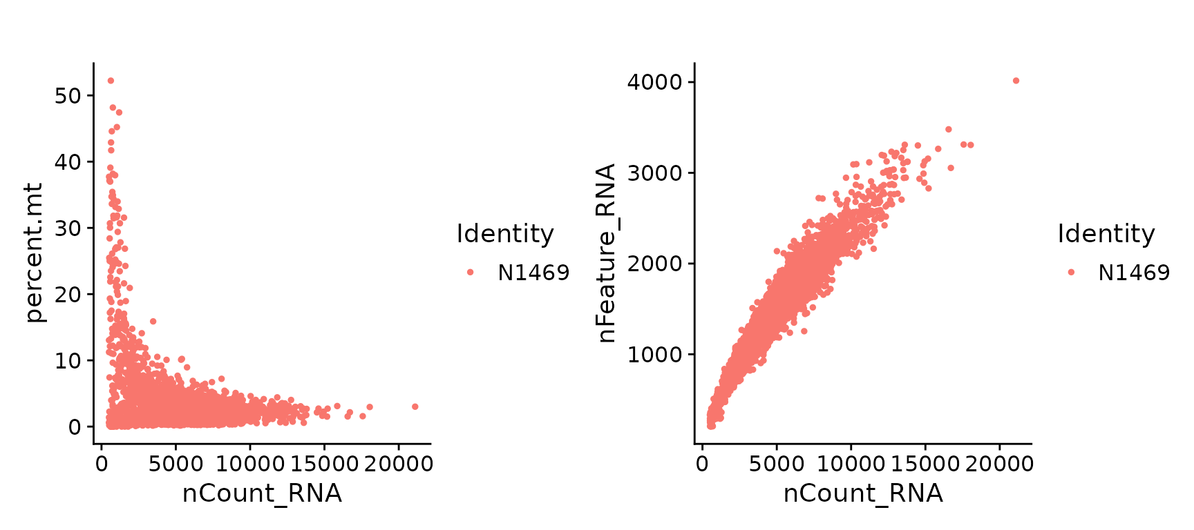
Scatter plots of QC metrics.
For this particular data, we filter cells that have unique feature less than 500 and with >20% mitochondrial counts.
N1469 <- subset(N1469, subset = nFeature_RNA > 500 & percent.mt < 20)Normalization
After cell filtering, the next step is normalization. Normalization is useful for removing cell-specific biases.
Here, we perform the default normalization method in Seurat, which divides gene counts by the total counts for each cell, multiplies this by a scale factor of 10,000, and then log-transforms the result.
N1469 <- NormalizeData(N1469)Highly variable genes
Single cell RNA-seq data is often used for exploring heterogeneity within cell population. To reduce the computational complexity of downstream calculations and also to focus on the true biological signal, a subset of highly variable genes (HVGs) is often selected prior to downstream analyses. One of the most commonly used strategies is to take the top genes with the highest variances across all the cells. The choice of the number of HVGs is fairly arbitrary, with any value from 500 to 5000 considered reasonable.
For this data, we select top 1500 HVGs to be used in downstream analyses such as PCA and UMAP visualization.
N1469 <- FindVariableFeatures(N1469, selection.method="vst", nfeatures=1500)A mean-variance plot can be produced for visualizing the top variable genes.
top50 <- head(VariableFeatures(N1469), 50)
plot1 <- VariableFeaturePlot(N1469)
plot2 <- LabelPoints(plot=plot1, points=top50, repel=TRUE)
plot2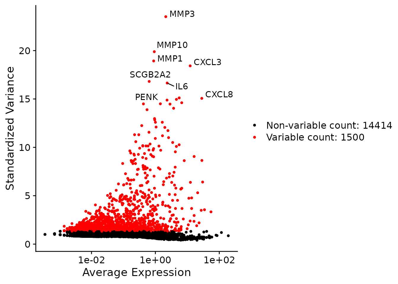
A mean-variance plot where top 1500 HVGs are highlighted in red and top 50 HVGs are labelled.
Before proceeding to dimensional reduction, we apply a linear transformation to “scale” the data. This data scaling is performed by the ScaleData() function, which standardizes the expression of each gene to have a mean expression of 0 and a variance of 1 across all the cells. This step gives equal weight to the genes used in downstream analyses so that highly-expressed genes do not dominate.
By default, the scaling process is only applied to the previously identified 1500 HVGs as these HVGs are used for the downstream analyses.
N1469 <- ScaleData(N1469)Dimensional reduction
Dimensional reduction is an essential step in single cell analysis. It summarizes the variances of thousands of genes in a much lower numbers of dimensions, hence reduces computational work in downstream analyses. A simple, highly effective and widely used approach for linear dimensional reduction is principal components analysis (PCA). The top PCs would capture the dominant factors of heterogeneity in the data set.
Here, we perform PCA on the scaled data. By default, only the previously determined 1500 HVGs are used and the first 50 PCs are computed and returned. The PCA results can be visualized in a PCA plot.
N1469 <- RunPCA(N1469, features=VariableFeatures(N1469))
DimPlot(N1469, reduction = "pca")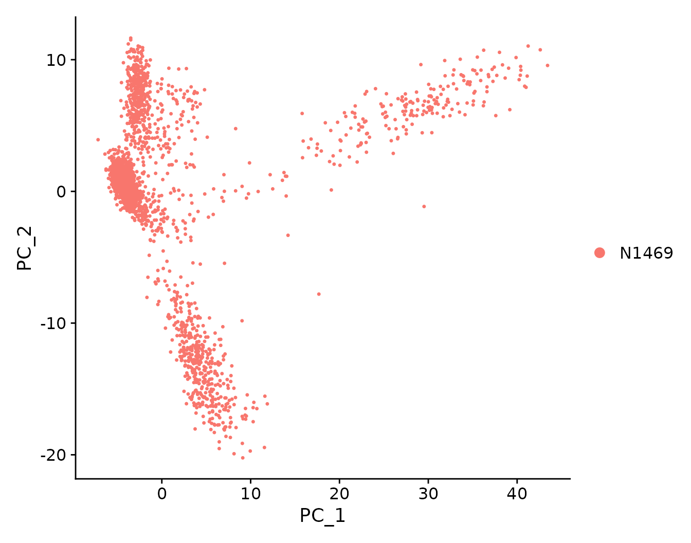
PCA plot showing the first two principal components of the data.
Although PCA greatly reduces the dimension of the data from thousands of genes to 50 PCs, it is still difficult to visualize and interpret the 50 PCs at the same time. Therefore, further dimensionality reduction strategies are required to compress the data into 2-3 dimensions for a more intuitive understanding of the data. The two popular non-linear dimensional reduction techniques are t-stochastic neighbor embedding (tSNE) (Van der Maaten and Hinton 2008) and uniform manifold approximation and projection (UMAP) (McInnes, Healy, and Melville 2018).
It is debatable whether the UMAP or tSNE visualization is better. UMAP tends to have more compact visual clusters but reduces resolution within each cluster. The main reason that UMAP has an increasing popularity is that UMAP is much faster than tSNE. Note that both UMAP and tSNE involve a series of randomization steps so setting the seed is critical.
Here we perform both UMAP and tSNE for dimensional reduction and visualization. The top 30 PCs are used as input and a random seed is used for reproducibility.
dimUsed <- 30
N1469 <- RunUMAP(N1469, dims=1:dimUsed, seed.use=2021, verbose=FALSE)
N1469 <- RunTSNE(N1469, dims=1:dimUsed, seed.use=2021)
plot1 <- DimPlot(N1469, reduction = "umap")
plot2 <- DimPlot(N1469, reduction = "tsne")
plot1 + plot2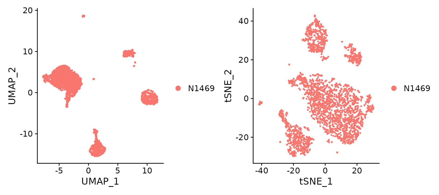
UMAP and t-SNE visualization
Cell clustering
Cell clustering is a procedure in scRNA-seq data analysis to group cells with similar expression profiles. It is an important step for summarizing information and providing biological interpretation of the data. Seurat offers a graph-based clustering approach, which is one of the most popular clustering algorithms due to its flexibilty and scalability for large scRNA-seq datasets.
One of the most commonly asked questions in cell clustering is “how many cell clusters are there in the data?” This question is often hard to answer since we can define as many clusters as we want. In fact, the number of clusters would depend on the biological questions of interest (eg. whether resolution of the major cell types will be sufficient or resolution of subtypes is required). In practice, we often experiment with different resolution in data exploration to obtain the “optimal” resolution that provides the best answer to the questions of our interest.
In Seurat, the cell clustering procedure starts by constructing a KNN graph using the FindNeighbors() function. Here, we use the top 30 PCs as input. Then the Seurat FindClusters() function applies the Louvain algorithm (by default) to group cells together. For this particular data, we set the resolution parameter to 0.1. The final clusters can be found using the Idents() function.
N1469 <- FindNeighbors(N1469, dims=1:dimUsed)
N1469 <- FindClusters(N1469, resolution=0.1)
## Modularity Optimizer version 1.3.0 by Ludo Waltman and Nees Jan van Eck
##
## Number of nodes: 2868
## Number of edges: 109080
##
## Running Louvain algorithm...
## Maximum modularity in 10 random starts: 0.9600
## Number of communities: 5
## Elapsed time: 0 seconds##
## 0 1 2 3 4
## 1699 507 421 213 28We can visualize the cell clusters in a UMAP plot.
DimPlot(N1469, reduction = "umap", label = TRUE)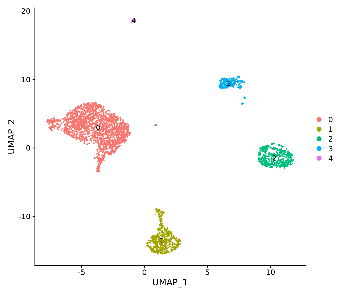
UMAP visualization where cells are coloured by cell cluster.
Marker genes identification
The next step after cell clustering is to identify marker genes that drive separation between the cell clusters. Marker genes are usually obtained by performing differential expression analyses between different clusters. In Seurat, the differential expression analysis is performed by the FindMarkers() function. By default, it identifies positive and negative markers of a single cluster (specified in ident.1), compared to all other cells.
To increase the computational speed, the Seurat FindMarkers() function only performs DE tests on a subset of genes that satisfy certain thresholds. The min.pct argument requires a gene to be detected at a minimum percentage in either of the two groups of cells, and by default it is set to 10%. The logfc.threshold limits testing to genes of which the log-fold change between the two groups is above a certain level (0.25 by default). By default the FindMarkers() function performs Wilcoxon Rank Sum tests, but other statistical tests (eg. likelihood-ratio test, t-test) are also available.
Here we find all markers of cluster 1 as follows.
cluster1.markers <- FindMarkers(N1469, ident.1 = 1, min.pct = 0.25)
head(cluster1.markers)
## p_val avg_log2FC pct.1 pct.2 p_val_adj
## CXCL13 0.00e+00 4.17 0.615 0.016 0.00e+00
## DNAJC12 0.00e+00 2.59 0.783 0.027 0.00e+00
## PTHLH 0.00e+00 2.87 0.698 0.016 0.00e+00
## BATF 0.00e+00 2.15 0.684 0.034 0.00e+00
## TFF3 0.00e+00 3.46 0.803 0.010 0.00e+00
## AGR2 3.05e-304 2.22 0.568 0.007 4.85e-300To find all markers distinguishing cluster 2 from clusters 0 and 1, we use the following lines.
cluster2.markers <- FindMarkers(N1469, ident.1 = 2, ident.2 = c(0, 1), min.pct = 0.25)
head(cluster2.markers)
## p_val avg_log2FC pct.1 pct.2 p_val_adj
## ACTG2 0.00e+00 5.09 0.789 0.035 0.0e+00
## CAV1 0.00e+00 3.55 0.891 0.092 0.0e+00
## TPM2 0.00e+00 3.63 0.900 0.068 0.0e+00
## KRT5 0.00e+00 3.79 0.929 0.138 0.0e+00
## KRT14 0.00e+00 5.40 0.969 0.057 0.0e+00
## SERPINB5 2.57e-292 2.26 0.686 0.032 4.1e-288The Seurat FindAllMarkers() function automates the marker detection process for all clusters. Here we find markers for every cluster compared to all remaining cells, report only the positive ones.
N1469.markers <- FindAllMarkers(N1469, only.pos = TRUE, min.pct = 0.25, logfc.threshold = 0.25)We select the top 3 marker genes for each of cluster and list them below.
topMarkers <- split(N1469.markers, N1469.markers$cluster)
top3 <- lapply(topMarkers, head, n=3)
top3 <- do.call("rbind", top3)
top3
## p_val avg_log2FC pct.1 pct.2 p_val_adj cluster gene
## 0.MMP7 0 4.06 0.957 0.216 0 0 MMP7
## 0.PDZK1IP1 0 2.50 0.950 0.314 0 0 PDZK1IP1
## 0.RPL12 0 1.29 0.999 0.974 0 0 RPL12
## 1.CXCL13 0 4.17 0.615 0.016 0 1 CXCL13
## 1.TFF3 0 3.46 0.803 0.010 0 1 TFF3
## 1.PTHLH 0 2.87 0.698 0.016 0 1 PTHLH
## 2.KRT14 0 5.41 0.969 0.056 0 2 KRT14
## 2.ACTG2 0 5.09 0.789 0.037 0 2 ACTG2
## 2.KRT5 0 3.80 0.929 0.134 0 2 KRT5
## 3.DCN 0 5.76 0.920 0.015 0 3 DCN
## 3.AKR1C1 0 4.97 0.859 0.024 0 3 AKR1C1
## 3.APOD 0 4.56 0.770 0.026 0 3 APOD
## 4.UBE2C 0 2.71 1.000 0.006 0 4 UBE2C
## 4.CDK1 0 1.48 0.679 0.001 0 4 CDK1
## 4.MKI67 0 1.37 0.714 0.000 0 4 MKI67The expression level of the top marker genes can be overlaid on the UMAP plots for visualization.
FeaturePlot(N1469, features = top3$gene, ncol=3)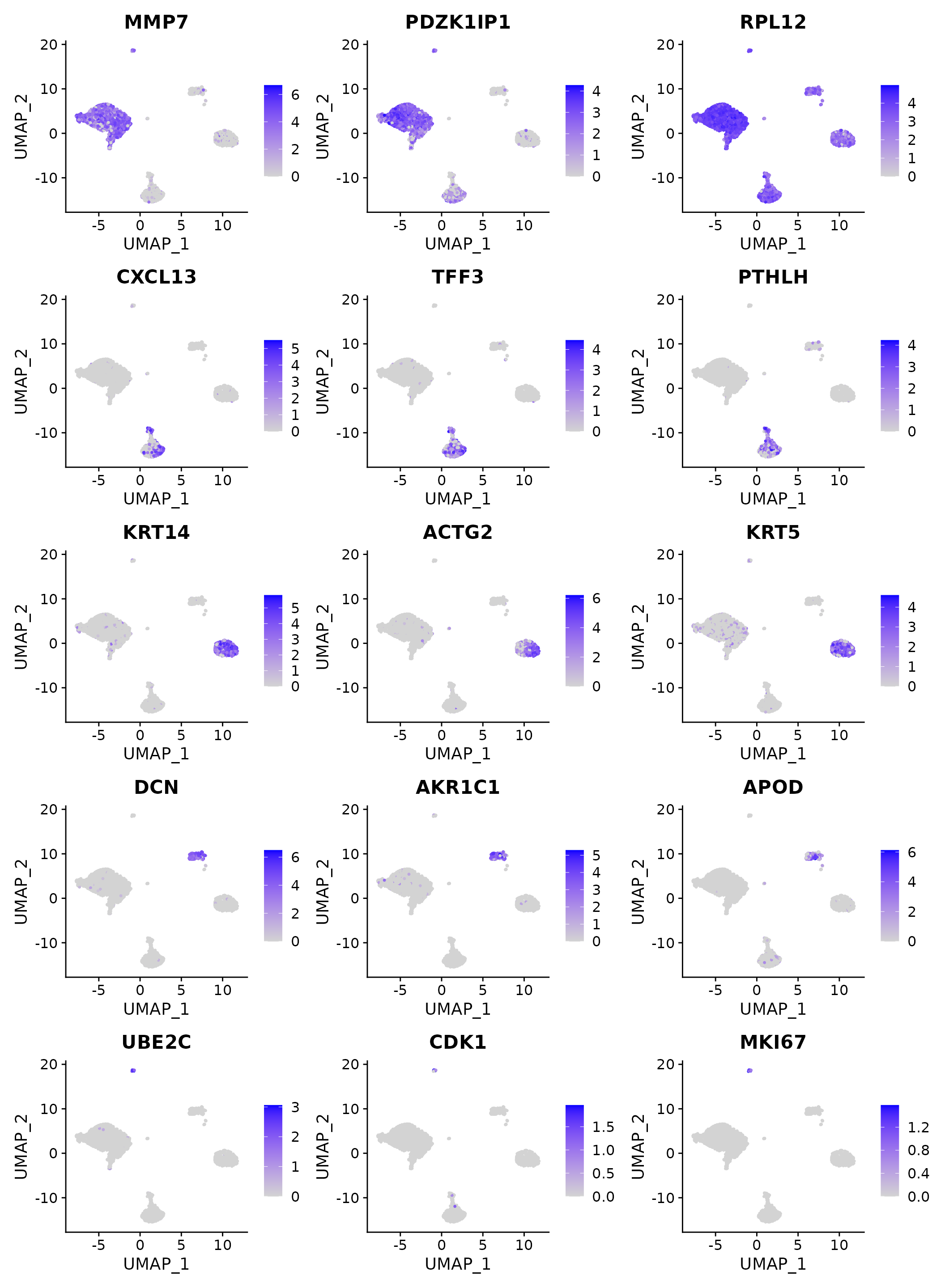
Top marker expression visualizations on a UMAP plot.
A dot plot can also be produced for visualizing the top marker genes.
DotPlot(N1469, features = top3$gene, dot.scale = 8) + RotatedAxis()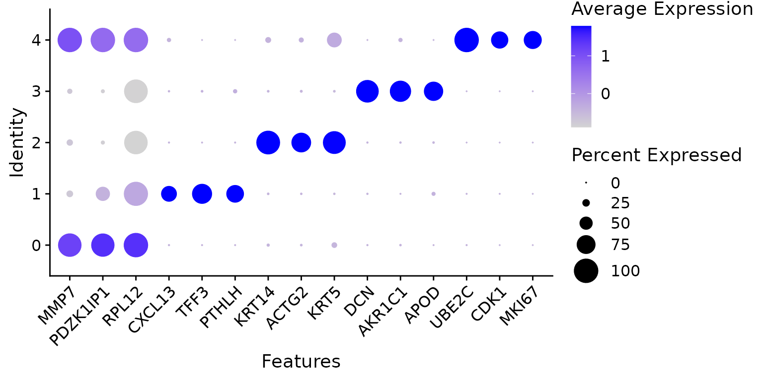
A dot plot of top marker genes of each cluster.
Cell type annotation
Interpreting cell clusters in biological context is one of the most challenging tasks in scRNA-seq data analysis. Prior biological knowledge is often required to do so. Marker genes from the literatures or the curated gene sets (e.g., Gene Ontology, KEGG pathways) are the common sources of prior information. Alternatively, we can use published reference datasets where samples are well annotated with cell type information.
Here we use a reference bulk RNA-seq dataset of human mammary gland epithelium from the same study (Pal et al. 2021). This reference RNA-seq (GSE161892) data consists of a total of 34 samples from basal, luminal progenitor (LP), mature luminal (ML), and stromal cell types. Differential expression analysis of this reference data was performed using limma-voom and TREAT (Law et al. 2014; McCarthy and Smyth 2009). Genes were considered cell type-specific if they were upregulated in one cell type vs all other types. This yielded 515, 323, 765, and 1094 signature genes for basal, LP, ML, and stroma, respectively.
Here we download those signature genes and load them into R.
url.Signatures <- "https://github.com/SmythLab/scRNAseq-Workshop/raw/main/Data/Human-PosSigGenes.RData"
utils::download.file(url.Signatures, destfile="Data/Human-PosSigGenes.RData", mode="wb")
We restrict the signature genes to those expressed in the single cell data.
load("Data/Human-PosSigGenes.RData")
HumanSig <- list(Basal=Basal, LP=LP, ML=ML, Str=Str)
HumanSig <- lapply(HumanSig, intersect, rownames(N1469))
To associate each cell in the single cell data with the four cell populations in the reference bulk data, we compute the signature scores of the four cell populations for each cell. Here the signature score of a particular cell type is defined as the average expression level of the cell type-specific genes in a given cell.
SigScore <- list()
for(i in 1:length(HumanSig)){
    SigScore[[i]] <- colMeans(N1469@assays$RNA@data[HumanSig[[i]], ])
}
We can visualize the signature scores in both UMAP plots and violin plots.
SigScores <- do.call("cbind", SigScore)
colnames(SigScores) <- c("Basal", "LP", "ML", "Stroma")
N1469@meta.data <- cbind(N1469@meta.data, SigScores)
FeaturePlot(N1469, features = colnames(SigScores))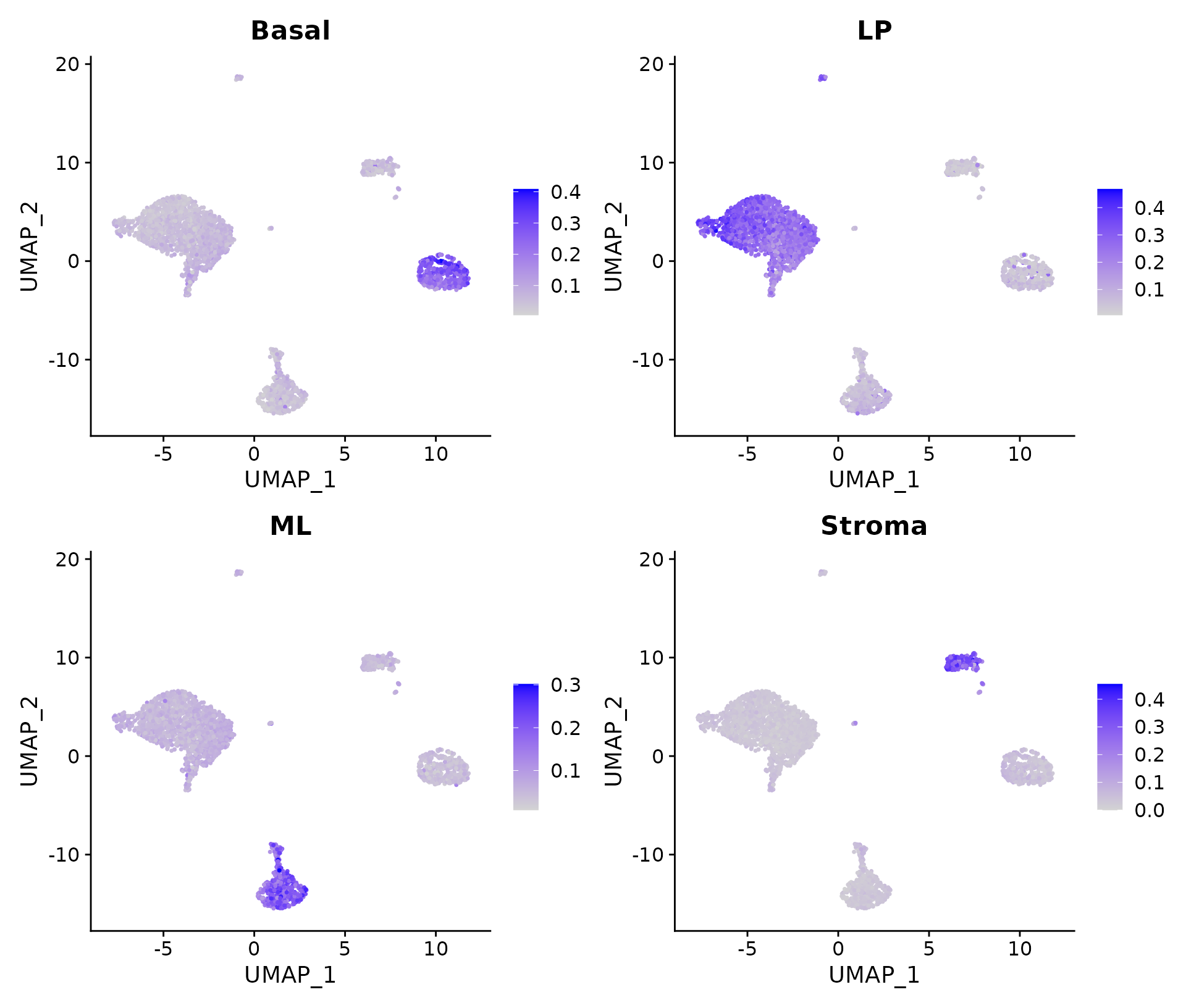
Signature scores.
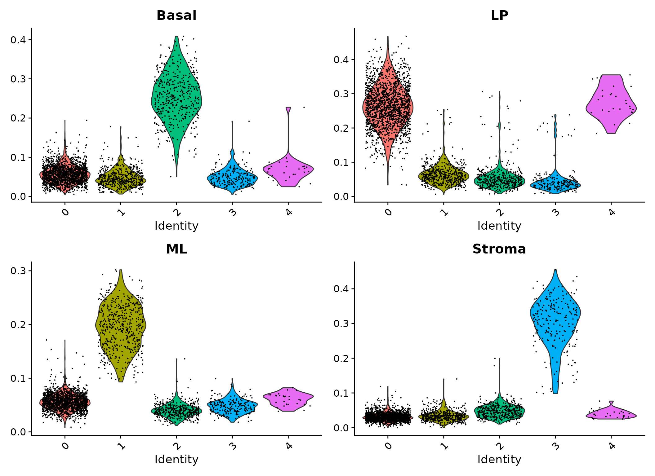
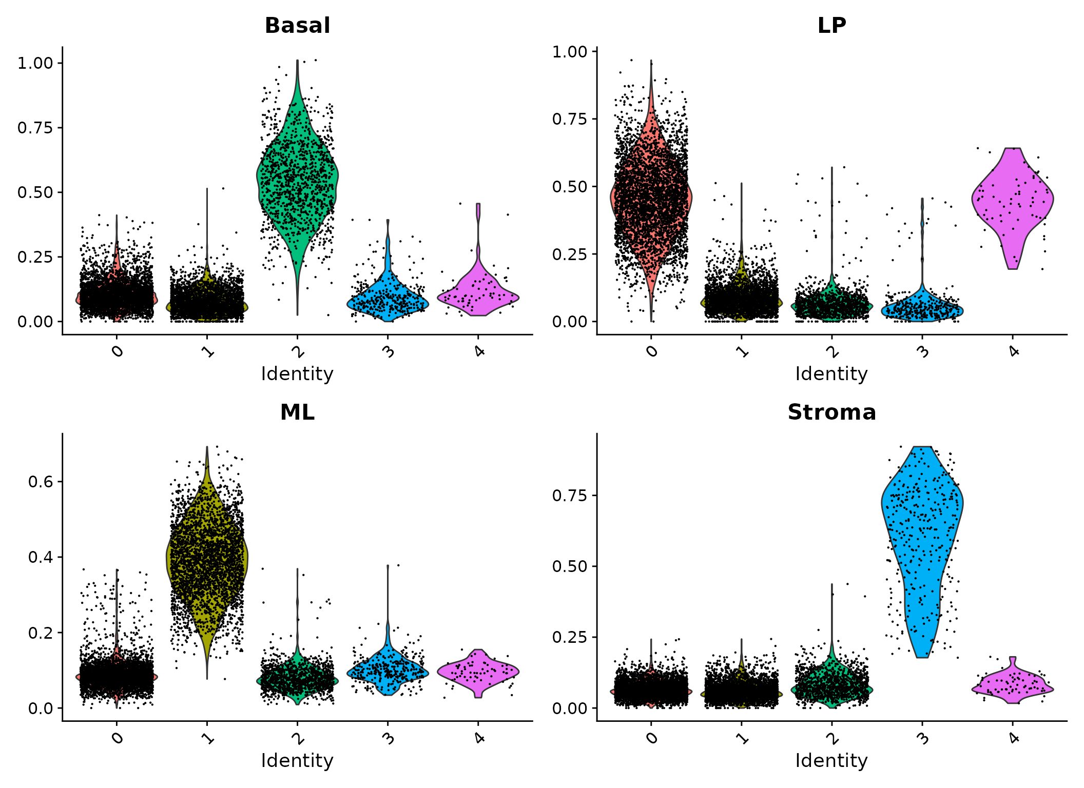
Violin plots of signature scores.
It can be seen that cells in cluster 2 have high expression levels of basal signature genes, suggesting these cells are likely to be basal cells. Likewise, cluster 0 and 4 are LP, cluster 1 is ML and cluster 3 is stroma.
Another way to visualize the correlation between the single cell and the reference bulk dataset is to make a ternary plot, which is useful for studies concerning three major cell populations. For this data, we are particularly interested in assigning each cell to one of the three major epithelial cell populations (basal, LP and ML).
We produce a ternary plot to see which of the three populations the cells are closer to. To measure the similarity between each cell and three populations, we count the numbers of expressed signatures (with at least 1 count) in each cell. The position of each cell on the ternary plot is determined by the numbers of expressed gene signatures of the three populations in that cell.
TN <- matrix(0L, ncol(N1469), 3L)
colnames(TN) <- c("LP", "ML", "Basal")
for(i in colnames(TN)){
    TN[, i] <- colSums(N1469@assays$RNA@counts[HumanSig[[i]], ] > 0L)
}
library(vcd)
col.p <- scales::hue_pal()(nlevels(Idents(N1469)))
ternaryplot(TN, cex=0.2, pch=16, col=col.p[Idents(N1469)], grid=TRUE)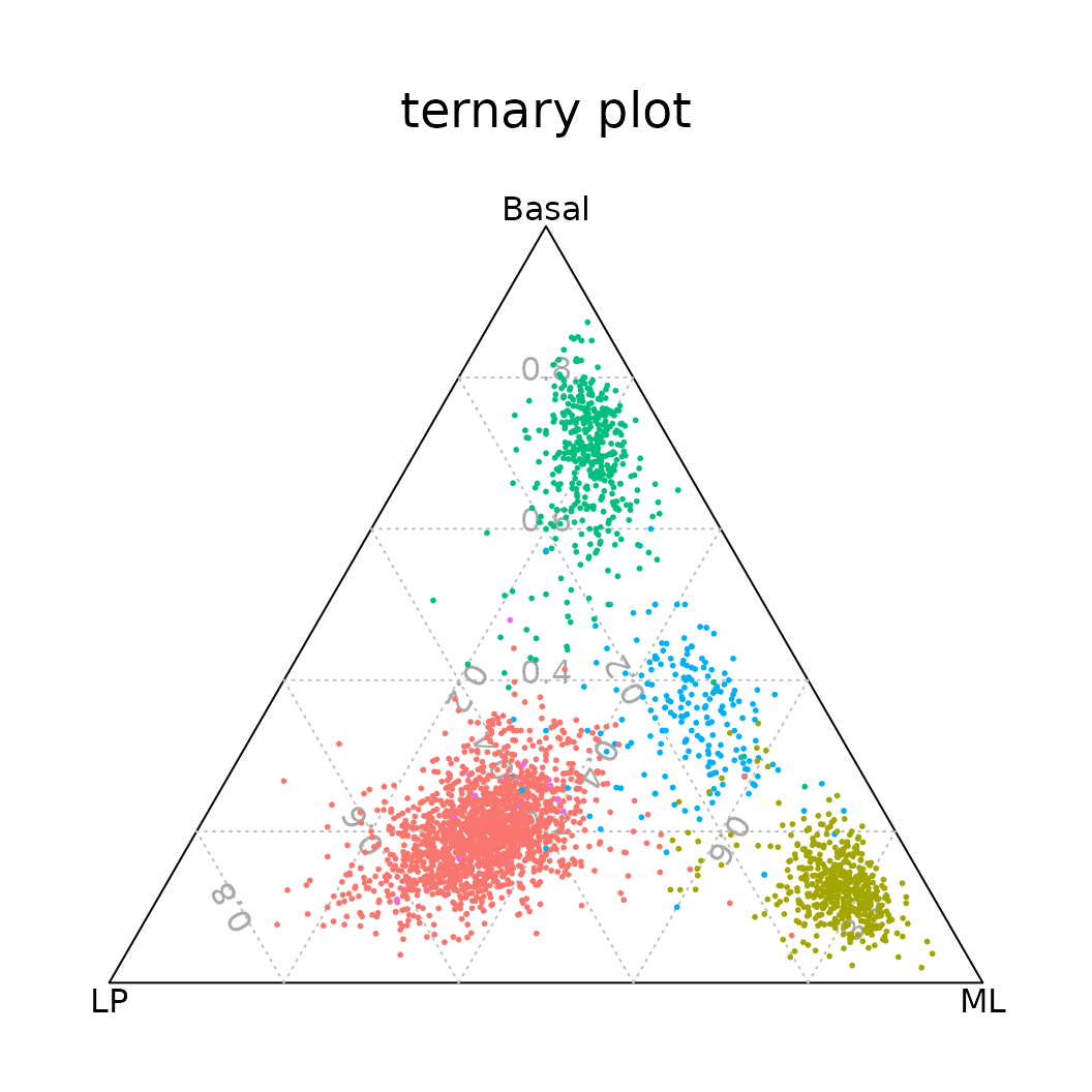
Ternary plot positioning each cell according to the proportion of basal, LP, or ML signature genes expressed by that cell.
Integration analysis
Batch effects
Comprehensive single cell RNA-seq experiments usually consist of multiple samples, which may be collected and prepared at different times, by different operators or with different reagents. These inconsistencies are referred to as “batch effects” and they often lead to systematic differences in the expression profiles of the scRNA-seq data. Batch effects can be problematic as they distort the genuine biological differences and may mislead the interpretation of the data. Therefore, integration methods that adjust for “batch effects” are highly essential in multi-sample single cell RNA-seq analysis.
Here, we will demonstrate how to perform an integration analysis in Seurat.
Read in the data
We use 10X single cell RNA-seq profiles of normal epithelial cells from four individual human. We first read in the raw data of all four samples for the integration analysis.
Samples <- c("N1469", "N0280", "N0230", "N0123")
RawData <- list()
RawData[[1]] <- N1469.data
for(i in 2:length(Samples)) {
    RawData[[i]] <- Read10X(data.dir = paste0("Data/", Samples[i]))
    colnames(RawData[[i]]) <- paste(Samples[i], colnames(RawData[[i]]), sep="_")
}
names(RawData) <- Samples
Then we create a list of four Seurat objects (one for each human sample). The same cell filtering criteria is applied to all the samples.
SeuratList <- list()
for(i in 1:length(Samples)){
    SeuratList[[i]] <- CreateSeuratObject(counts=RawData[[i]], project=Samples[i], min.cells=3, min.features=200)
    SeuratList[[i]][["percent.mt"]] <- PercentageFeatureSet(SeuratList[[i]], pattern = "^MT-")
    SeuratList[[i]] <- subset(SeuratList[[i]], subset = nFeature_RNA > 500 & percent.mt < 20)
}
We perform all the pre-processing steps (normalization and defining HVGs) for each individual sample. We skip the data scaling as all the samples will be automatically scaled in the integration step.
Data integration
Seurat implements an anchor-based method for integrating multiple single cell RNA-seq samples. The method first identifies pairs of cells between different samples (“anchors”) that are in a matched biological state. These “anchors” are then used to harmonize datasets into a single reference, of which the labels and data can be projected onto query datasets (Stuart et al. 2019).
We identify anchors using the FindIntegrationAnchors() function, which takes a list of Seurat objects as input.
Anchors <- FindIntegrationAnchors(SeuratList)We then use these anchors to integrate the four datasets together with IntegrateData(). This step creates an integrated data assay.
NormEpi <- IntegrateData(Anchors)Now we can run a single integrated analysis on all cells. The downstream analysis will be performed on corrected data (the integrated data assay). The original unmodified data still resides in the RNA assay.
Dimensional reduction
The dimensional reduction step for the integrated data is the same as for a single sample. We first scale the data.
NormEpi <- ScaleData(NormEpi, verbose=FALSE)Then we perform dimensional reduction (PCA and UMAP) for the integrated data. The UMAP visualization of the integrated data is shown below.
dimUsed <- 30
NormEpi <- RunPCA(NormEpi, npcs=dimUsed, verbose=FALSE)
NormEpi <- RunUMAP(NormEpi, dims=1:dimUsed, seed.use=2021)
DimPlot(NormEpi, reduction = "umap", group.by="orig.ident")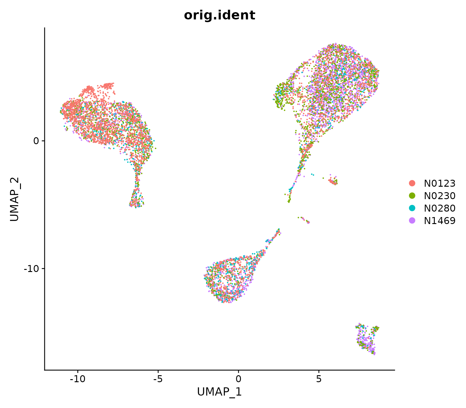
UMAP visualization of the integrated data where cells are coloured by patient.
From the UMAP it can be seen that cells are not clustered by sample, indicating the batch effects between different samples have been removed. It is also noticable that each of the big clusters contains a mixture of cells from different samples, suggesting these four samples share a similar cell type composition.
Cell clustering
We then proceed to cell clustering of the integrated data, which is done in the same way as before.
NormEpi <- FindNeighbors(NormEpi, dims=1:dimUsed)
NormEpi <- FindClusters(NormEpi, resolution=0.1)
## Modularity Optimizer version 1.3.0 by Ludo Waltman and Nees Jan van Eck
##
## Number of nodes: 8691
## Number of edges: 364530
##
## Running Louvain algorithm...
## Maximum modularity in 10 random starts: 0.9638
## Number of communities: 5
## Elapsed time: 1 seconds##
## 0 1 2 3 4
## 3956 3106 1222 341 66The clustering results are shown in the UMAP plot below.
DimPlot(NormEpi, reduction = "umap", label=TRUE)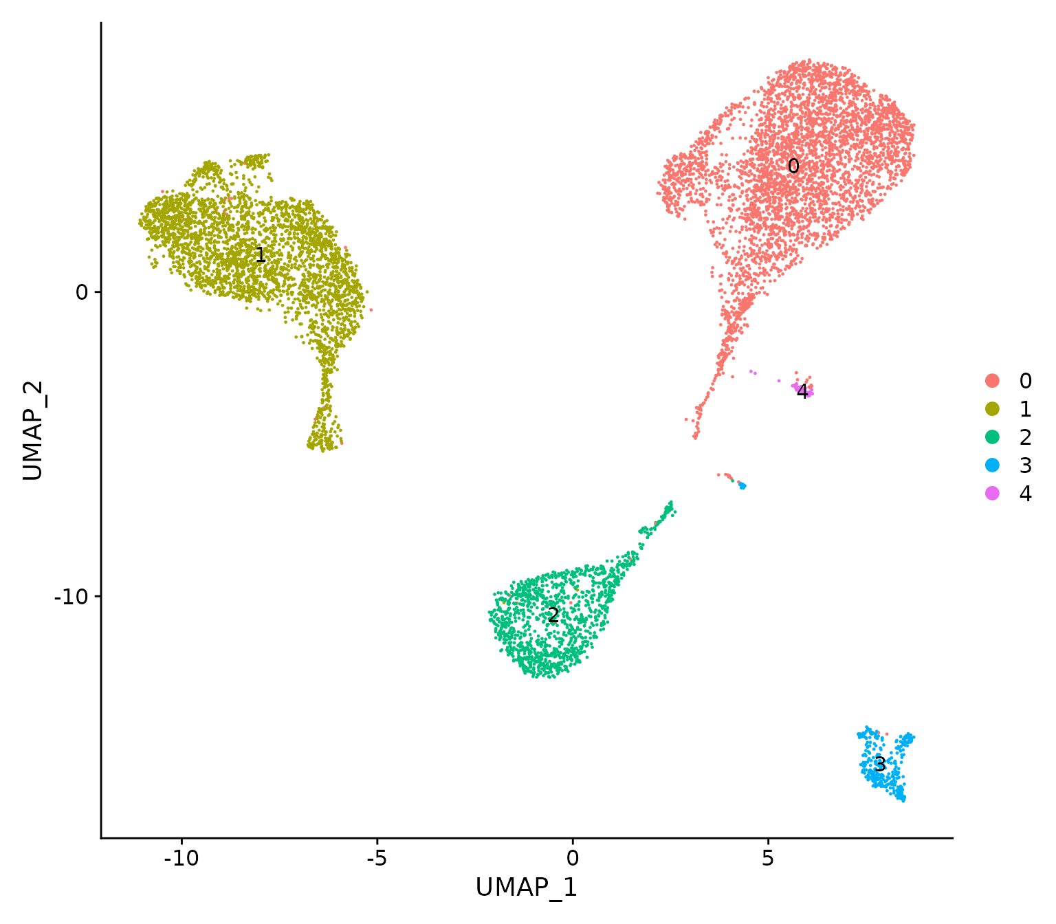
UMAP visualization of the integrated data where cells are coloured by cluster.
Cell type annotation
The same human reference data is used for cell type annotation. The signature scores of the four cell populations are calculated for each cell in the integrated data.
HumanSig2 <- list(Basal=Basal, LP=LP, ML=ML, Str=Str)
HumanSig2 <- lapply(HumanSig2, intersect, rownames(NormEpi))
SigScore2 <- list()
for(i in 1:length(HumanSig2)){
    SigScore2[[i]] <- colMeans(NormEpi@assays$RNA@data[HumanSig2[[i]], ])
}
SigScores2 <- do.call("cbind", SigScore2)
colnames(SigScores2) <- c("Basal", "LP", "ML", "Stroma")
NormEpi@meta.data <- cbind(NormEpi@meta.data, SigScores2)
We then produce feature plots and violin plots to visualize the signature scores.
FeaturePlot(NormEpi, features = colnames(SigScores2))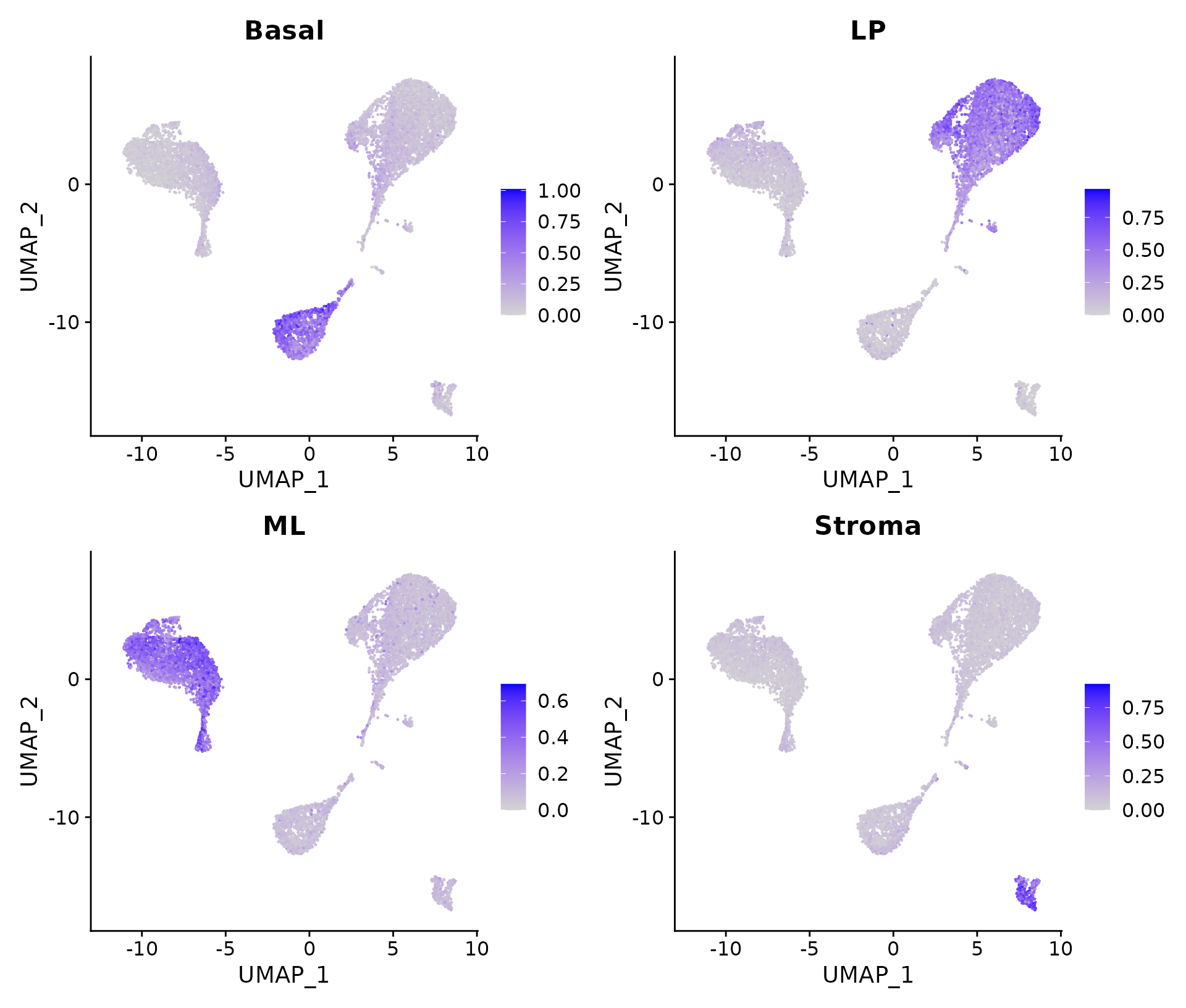
Signature scores for the integrated data.
Violin plots of signature scores for the integrated data.
It can be seen that cells in cluster 2 have high expression levels of basal signature genes, suggesting these cells are likely to be basal cells. Likewise, cluster 0 and 4 are LP or LP-like, cluster 1 is ML, and cluster 3 is stroma.
A ternary plot can also be generated in the same way to examine the correlation between the cells and the three major epithelial populations.
TN2 <- matrix(0L, ncol(NormEpi), 3L)
colnames(TN2) <- c("LP", "ML", "Basal")
for(i in colnames(TN2)){
    TN2[, i] <- colSums(NormEpi@assays$RNA@counts[HumanSig2[[i]], ] > 0L)
}
col.p <- scales::hue_pal()(nlevels(Idents(NormEpi)))
ternaryplot(TN2, cex=0.2, pch=16, col=col.p[Idents(NormEpi)], grid=TRUE)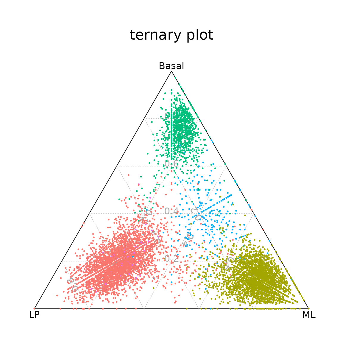
Ternary plot positioning each cell according to the proportion of basal, LP, or ML signature genes expressed by that cell.
Differential expression analysis by pseudo-bulk
Biological variation
In RNA-seq experiments with replicate samples, biological variation represents the variation of the underlying gene abundances between the replicates. Accounting for biological variation is crucial in RNA-seq DE analysis. Many statistically rigorous methods and software packages have been developed for estimating biological variation and incorporating it into the DE analysis (e.g., edgeR, limma, DESeq2 etc.).
For single cell RNA-seq experiments with biological replicates, one should also take into account the biological variation between different replicate samples where cells are obtained. However, applying bulk RNA-seq DE methods directly to single cell RNA-seq data is not appropriate as each cell is not independent biological replicate. One of the commonly used methods to account for biological variation between replicates is the “pseudo-bulk” approach, where read counts from all cells with the same combination of label (e.g., cluster) and sample are summed together (Tung et al. 2017).
Creating pseudo-bulk samples
We first extract the cluster and sample information from the integrated Seurat object and combine them together. The numbers of cells under different combinations of cell cluster and sample are shown below.
sampID <- NormEpi@meta.data$orig.ident
clustID <- Idents(NormEpi)
sampClust <- paste(sampID, clustID, sep="_Clst")
table(sampClust)
## sampClust
## N0123_Clst0 N0123_Clst1 N0123_Clst2 N0123_Clst3 N0123_Clst4 N0230_Clst0 N0230_Clst1
## 841 1608 359 12 20 1041 579
## N0230_Clst2 N0230_Clst3 N0230_Clst4 N0280_Clst0 N0280_Clst1 N0280_Clst2 N0280_Clst3
## 142 79 16 360 422 301 40
## N0280_Clst4 N1469_Clst0 N1469_Clst1 N1469_Clst2 N1469_Clst3 N1469_Clst4
## 3 1714 497 420 210 27We then form pseudo-bulk samples by aggregating the read counts for each gene by cluster-sample combination.
rawCounts <- as.matrix(NormEpi@assays$RNA@counts)
counts <- t(rowsum(t(rawCounts), group=sampClust))
We create a DGEList object using the pseudo-bulk samples and proceed to the edgeR DE analysis pipeline (Chen, Lun, and Smyth 2016).
Filtering
The library size (total number of reads) of each pseudo-bulk sample highly depends on the number of cells in that sample. We remove the samples with library size less than 50,000.
keep.sample <- y$samples$lib.size > 5e4
table(keep.sample)
## keep.sample
## FALSE TRUE
## 1 19
y <- y[,keep.sample]The gene filtering is performed by the filterByExpr function in edgeR.
keep.gene <- filterByExpr(y)
table(keep.gene)
## keep.gene
## FALSE TRUE
## 6990 10810
y <- y[keep.gene,,keep=FALSE]Normalization
We perform TMM normalization (Robinson and Oshlack 2010) to adjust for the compositional biases between the samples. The normalization factors are listed below.
y <- calcNormFactors(y)
y$samples
## group lib.size norm.factors Patient
## N0123_Clst0 0 4252813 0.927 N0123
## N0123_Clst1 1 6070461 1.068 N0123
## N0123_Clst2 2 924418 0.941 N0123
## N0123_Clst4 4 162634 1.232 N0123
## N0230_Clst0 0 4229170 0.943 N0230
## N0230_Clst1 1 2035340 1.060 N0230
## N0230_Clst2 2 433661 0.953 N0230
## N0230_Clst3 3 221680 1.165 N0230
## N0230_Clst4 4 104554 1.542 N0230
## N0280_Clst0 0 3832676 0.768 N0280
## N0280_Clst1 1 2190221 1.090 N0280
## N0280_Clst2 2 1355621 0.971 N0280
## N0280_Clst3 3 190483 1.058 N0280
## N0280_Clst4 4 55550 1.309 N0280
## N1469_Clst0 0 10489687 0.723 N1469
## N1469_Clst1 1 2455788 0.872 N1469
## N1469_Clst2 2 1825712 0.802 N1469
## N1469_Clst3 3 1184520 0.845 N1469
## N1469_Clst4 4 250531 1.059 N1469Data exploration
We produce an MDS plot to visualize the relationship between all the pseudo-bulk samples.
Cluster <- factor(y$samples$group)
Patient <- y$samples$Patient
par(mfrow=c(1,2))
plotMDS(y, pch=16, col=col.p[Cluster], main="By cluster")
legend("bottomright", legend=paste("Cluster", levels(Cluster)), pch=16, col=col.p)
plotMDS(y, pch=16, col=Patient, main="By sample")
legend("bottomright", legend=levels(Patient), pch=16, col=1:5)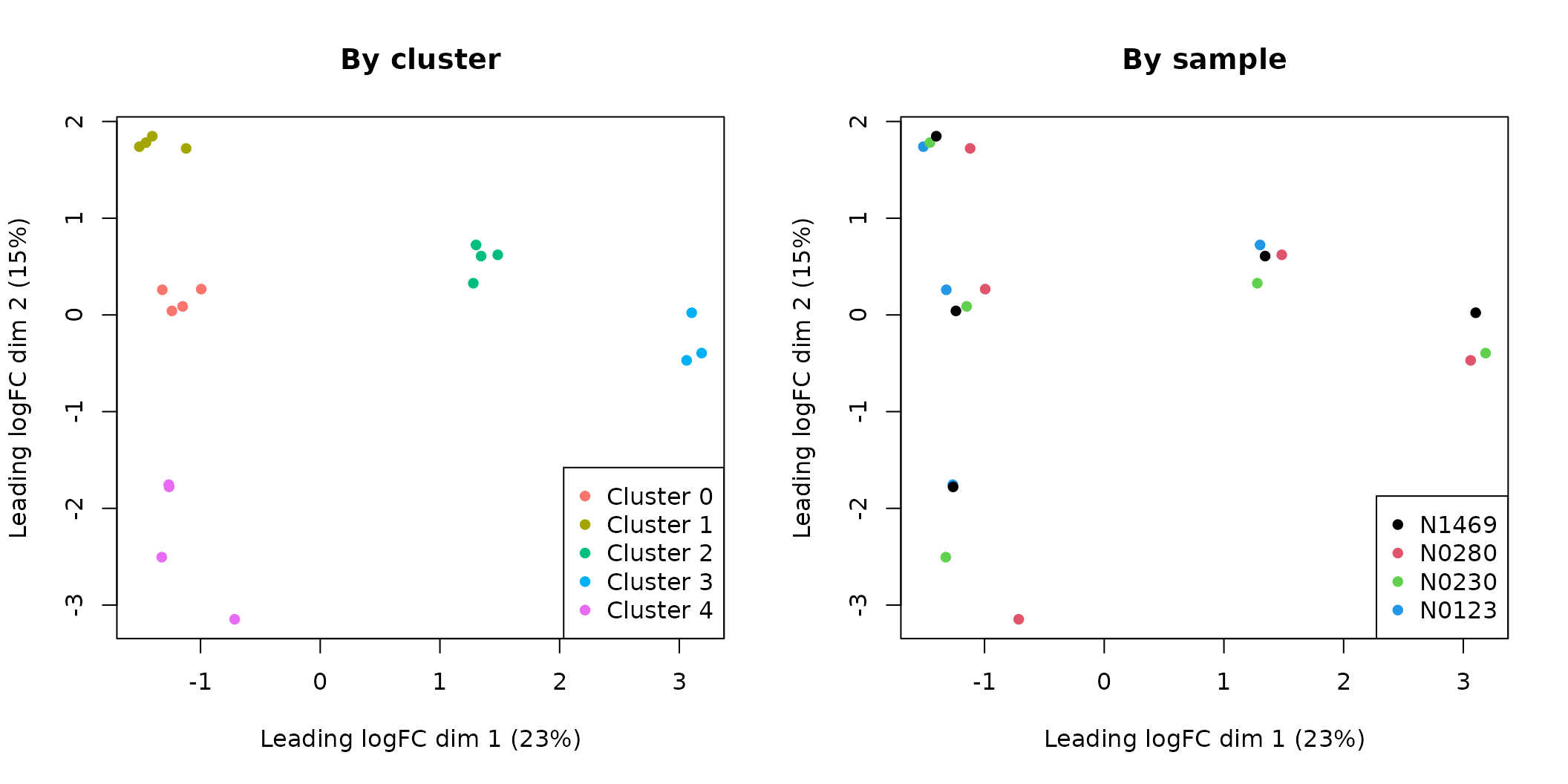
MDS plots of the pseudo-bulk samples.
From the MDS plot it can be seen that the pseudo-bulk samples are grouped by cluster defined at the single cell level. We also notice that the pseudo-bulk samples from luminal (cluster 0, 1 and 4), basal (cluster 2) and stroma (cluster 3) are separated in the first dimension. The three luminal cell populations (cluster 0, 1 and 4) are separated from each other in the second dimension.
We use the cluster and sample information to create a design matrix as follows.
design <- model.matrix(~ 0 + Cluster + Patient)
colnames(design)
## [1] "Cluster0" "Cluster1" "Cluster2" "Cluster3" "Cluster4"
## [6] "PatientN0280" "PatientN0230" "PatientN0123"Dispersion estimation
We estimate negative binomial dispersions and quasi-likelihood dispersions as follows.
y <- estimateDisp(y, design)
fit <- glmQLFit(y, design)
The dispersions can be examined in the following plots.
par(mfrow=c(1,2))
plotBCV(y)
plotQLDisp(fit)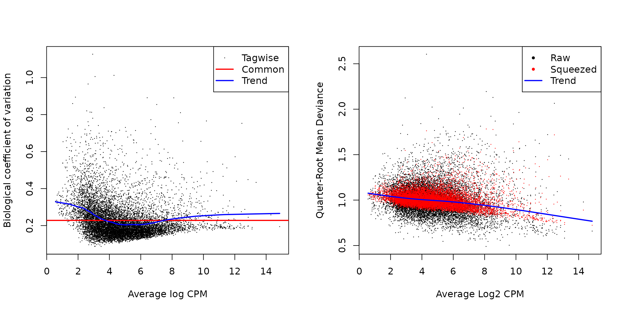
edgeR BCV and quasi-likelihood dispersion plots.
Differential expression
For the differential expression analysis, we are particularly interested in the genes that are up-regulated in each cluster compared with all the other clusters. Therefore, we create a contrast matrix as follows. Each column of the matrix represents a testing constrast that compares one cluster with the average of all the other clusters.
ncls <- nlevels(Idents(NormEpi))
contr <- rbind( matrix(1/(1-ncls), ncls, ncls),
                matrix(0, ncol(design)-ncls, ncls) )
diag(contr) <- 1
rownames(contr) <- colnames(design)
colnames(contr) <- paste0("Cluster", levels(Idents(NormEpi)))
contr
## Cluster0 Cluster1 Cluster2 Cluster3 Cluster4
## Cluster0 1.00 -0.25 -0.25 -0.25 -0.25
## Cluster1 -0.25 1.00 -0.25 -0.25 -0.25
## Cluster2 -0.25 -0.25 1.00 -0.25 -0.25
## Cluster3 -0.25 -0.25 -0.25 1.00 -0.25
## Cluster4 -0.25 -0.25 -0.25 -0.25 1.00
## PatientN0280 0.00 0.00 0.00 0.00 0.00
## PatientN0230 0.00 0.00 0.00 0.00 0.00
## PatientN0123 0.00 0.00 0.00 0.00 0.00We then perform quasi-likelihood F-test under each contrast. In order to focus on genes with strong DE signal, we test for the differences above a fold-change threshold of 1.3. This is done by calling the glmTreat function in edgeR. The results of all the tests are stored as a list of DGELRT objects.
test <- list()
for(i in 1:ncls) test[[i]] <- glmTreat(fit, contrast=contr[,i], lfc=log2(1.3))
names(test) <- colnames(contr)
The number of DE genes under each comparison can be viewed by the decideTestsDGE function.
dtest <- lapply(lapply(test, decideTestsDGE), summary)
dtest <- do.call("cbind", dtest)
colnames(dtest) <- colnames(contr)
dtest
## Cluster0 Cluster1 Cluster2 Cluster3 Cluster4
## Down 329 1181 1479 1252 655
## NotSig 8975 6982 7156 8184 9630
## Up 1506 2647 2175 1374 525We can view the top DE results using the topTags function. For example, to see the top 20 DE genes of cluster 2 vs all the other clusters, we use the following line.
topTags(test$Cluster2, n=20L)## Coefficient: -0.25*Cluster0 -0.25*Cluster1 1*Cluster2 -0.25*Cluster3 -0.25*Cluster4
## logFC unshrunk.logFC logCPM PValue FDR
## SERPINB5 6.33 6.35 6.87 2.98e-19 1.87e-15
## DLL1 5.88 5.90 6.27 3.62e-19 1.87e-15
## ACTG2 7.42 7.43 9.53 5.19e-19 1.87e-15
## DKK3 5.57 5.58 7.06 1.36e-18 3.03e-15
## CCND2 6.37 6.48 5.82 1.48e-18 3.03e-15
## TNS4 5.73 5.76 6.38 1.68e-18 3.03e-15
## CD200 6.37 6.40 6.81 2.96e-18 4.57e-15
## OXTR 5.75 5.77 6.57 1.75e-17 2.21e-14
## TUBB2B 4.15 4.15 7.89 1.84e-17 2.21e-14
## KRT5 6.03 6.04 9.16 2.08e-17 2.25e-14
## COL17A1 9.41 19.32 5.26 3.20e-17 3.15e-14
## KRT14 7.48 7.48 11.25 3.52e-17 3.17e-14
## NRP2 5.77 5.82 5.87 3.82e-17 3.17e-14
## TPM2 5.29 5.29 8.45 1.26e-16 9.71e-14
## FAM126A 4.08 4.10 5.97 1.43e-16 1.03e-13
## LAMA3 7.13 11.41 6.38 1.61e-16 1.07e-13
## MYLK 6.36 6.40 6.61 1.69e-16 1.07e-13
## MSRB3 5.28 5.31 5.38 3.24e-16 1.94e-13
## PPP1R3C 6.39 6.44 5.87 4.39e-16 2.50e-13
## MEG3 5.51 5.55 7.58 4.89e-16 2.64e-13We can extract the top 15 marker genes (up-regulated only) of each cluster as follows.
top <- 15
pseudoMakers <- list()
for(i in 1:ncls) {
    res <- test[[i]]$table
    ord <- order(log(res$PValue)*sign(res$logFC))
    pseudoMakers[[i]] <- rownames(y)[ord[1:top]]
}
Markers <- unlist(pseudoMakers)
Markers <- Markers[!duplicated(Markers)]
Then we create a heatmap using pheatmap for those top marker genes. The standardized log-CPM values of the marker genes are used for the expression levels on the heatmap. Genes and samples on the heatmap are reordered by the Ward method of hierarchical clustering, which correctly groups samples by cell cluster.
library(pheatmap)
lcpm <- cpm(y, log=TRUE)
expr <- t(scale(t(lcpm[Markers, ])))
annot <- data.frame(Cluster=paste0("Cluster ", Cluster), Patient=Patient)
rownames(annot) <- colnames(expr)
ann_colors <- list(Cluster=col.p[1:ncls], Patient=col.p[1:length(Samples)])
names(ann_colors$Cluster) <- paste0("Cluster ", levels(Idents(NormEpi)))
names(ann_colors$Patient) <- Samples
pheatmap(expr, color=colorRampPalette(c("blue","white","red"))(100), border_color="NA",
    breaks=seq(-2,2,length.out=101), cluster_cols=TRUE, scale="none", fontsize_row=7,
    show_colnames=FALSE, treeheight_row=70, treeheight_col=70, cutree_cols=ncls,
    clustering_method="ward.D2", annotation_col=annot, annotation_colors=ann_colors)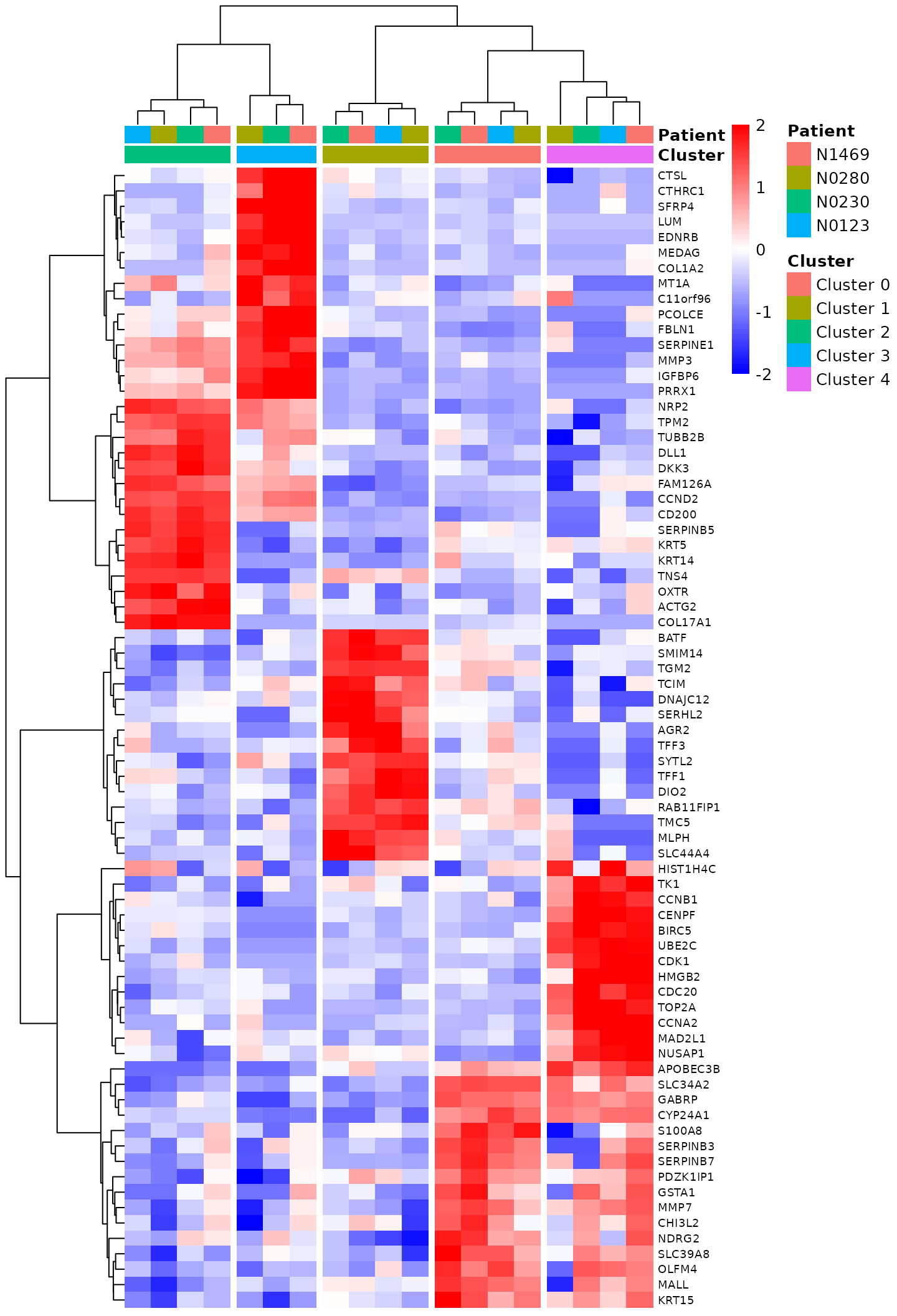
Heat map of the top marker genes.
Session info
## R version 4.1.0 (2021-05-18)
## Platform: x86_64-pc-linux-gnu (64-bit)
## Running under: Ubuntu 20.04.2 LTS
##
## Matrix products: default
## BLAS/LAPACK: /usr/lib/x86_64-linux-gnu/openblas-pthread/libopenblasp-r0.3.8.so
##
## locale:
##  [1] LC_CTYPE=en_US.UTF-8       LC_NUMERIC=C               LC_TIME=en_US.UTF-8
##  [4] LC_COLLATE=en_US.UTF-8     LC_MONETARY=en_US.UTF-8    LC_MESSAGES=C
##  [7] LC_PAPER=en_US.UTF-8       LC_NAME=C                  LC_ADDRESS=C
## [10] LC_TELEPHONE=C             LC_MEASUREMENT=en_US.UTF-8 LC_IDENTIFICATION=C
##
## attached base packages:
## [1] grid      stats     graphics  grDevices utils     datasets  methods   base
##
## other attached packages:
## [1] pheatmap_1.0.12    edgeR_3.35.0       limma_3.49.4       vcd_1.4-8
## [5] SeuratObject_4.0.2 Seurat_4.0.4
##
## loaded via a namespace (and not attached):
##   [1] Rtsne_0.15            colorspace_2.0-2      deldir_0.2-10
##   [4] ellipsis_0.3.2        ggridges_0.5.3        rprojroot_2.0.2
##   [7] fs_1.5.0              spatstat.data_2.1-0   farver_2.1.0
##  [10] leiden_0.3.9          listenv_0.8.0         ggrepel_0.9.1
##  [13] RSpectra_0.16-0       fansi_0.5.0           codetools_0.2-18
##  [16] splines_4.1.0         cachem_1.0.6          knitr_1.33
##  [19] polyclip_1.10-0       jsonlite_1.7.2        ica_1.0-2
##  [22] cluster_2.1.2         png_0.1-7             uwot_0.1.10
##  [25] shiny_1.6.0           sctransform_0.3.2     spatstat.sparse_2.0-0
##  [28] compiler_4.1.0        httr_1.4.2            Matrix_1.3-4
##  [31] fastmap_1.1.0         lazyeval_0.2.2        later_1.3.0
##  [34] htmltools_0.5.1.1     tools_4.1.0           igraph_1.2.6
##  [37] gtable_0.3.0          glue_1.4.2            RANN_2.6.1
##  [40] reshape2_1.4.4        dplyr_1.0.7           Rcpp_1.0.7
##  [43] scattermore_0.7       jquerylib_0.1.4       pkgdown_1.6.1
##  [46] vctrs_0.3.8           nlme_3.1-152          lmtest_0.9-38
##  [49] xfun_0.25             stringr_1.4.0         globals_0.14.0
##  [52] mime_0.11             miniUI_0.1.1.1        lifecycle_1.0.0
##  [55] irlba_2.3.3           goftest_1.2-2         future_1.21.0
##  [58] MASS_7.3-54           zoo_1.8-9             scales_1.1.1
##  [61] spatstat.core_2.3-0   ragg_1.1.3            promises_1.2.0.1
##  [64] spatstat.utils_2.2-0  parallel_4.1.0        RColorBrewer_1.1-2
##  [67] yaml_2.2.1            memoise_2.0.0         reticulate_1.20
##  [70] pbapply_1.4-3         gridExtra_2.3         ggplot2_3.3.5
##  [73] sass_0.4.0            rpart_4.1-15          stringi_1.7.3
##  [76] highr_0.9             desc_1.3.0            rlang_0.4.11
##  [79] pkgconfig_2.0.3       systemfonts_1.0.2     matrixStats_0.60.1
##  [82] evaluate_0.14         lattice_0.20-44       ROCR_1.0-11
##  [85] purrr_0.3.4           tensor_1.5            labeling_0.4.2
##  [88] patchwork_1.1.1       htmlwidgets_1.5.3     cowplot_1.1.1
##  [91] tidyselect_1.1.1      parallelly_1.27.0     RcppAnnoy_0.0.19
##  [94] plyr_1.8.6            magrittr_2.0.1        R6_2.5.1
##  [97] generics_0.1.0        withr_2.4.2           mgcv_1.8-36
## [100] pillar_1.6.2          fitdistrplus_1.1-5    survival_3.2-12
## [103] abind_1.4-5           tibble_3.1.3          future.apply_1.8.1
## [106] crayon_1.4.1          KernSmooth_2.23-20    utf8_1.2.2
## [109] spatstat.geom_2.2-2   plotly_4.9.4.1        rmarkdown_2.10
## [112] locfit_1.5-9.4        data.table_1.14.0     digest_0.6.27
## [115] xtable_1.8-4          tidyr_1.1.3           httpuv_1.6.2
## [118] textshaping_0.3.5     munsell_0.5.0         viridisLite_0.4.0
## [121] bslib_0.2.5.1